Sunday, April 2, 2017
Curtains and a HUGE Curtain Contest!!
Curtains and a HUGE Curtain Contest!!
And now – to announce a new and very exciting contest – courtesy of a long time sponsor – The Antique Drapery Rod Company! They are a sponsor because I am a client – and have been for years and years. Almost every curtain rod I’ve ever used is from their company.

John Fowler – the greatest curtain designer of the 20th century. He meticulously drew out the details of the swags and jabots of his creations:

Fowler’s sketch and the actual curtain created from it. Picture courtesy of Little Augury
As you know, in my opinion, professionally designed, sewn, and hung curtains are one of the most important elements in creating a finished look in a room. Installing curtains is something I beg a client to do – and most clients will fight me on this to the end. But – when the job is finished, I’ve rarely had a client say they regretted the decision to pay the extra expense.

Another 20th century master of curtains – Mario Buatta – shown here in a beautiful Houston house that was recently totally renovated into a mid-century, Hollywood glam fiasco.
Curtains provide an element that is hard to duplicate any other way. They add a texture, a coziness, and a sophistication to a room. Additionally, they add interest and color and create a look of professionalism. Curtains also quiet a room – the yards of fabric add a softness that actually muffles sound. It’s hard to deny their importance in a design.

Miles Redd, the John Fowler of the 21st century. His curtains are a fantasy – would this room be as spectacular without his fabulous creations?
I wrote an extensive story about curtains around six years ago – it is worth reading if you haven’t or if you need a primer on do’s and don’ts of curtains – read HERE.

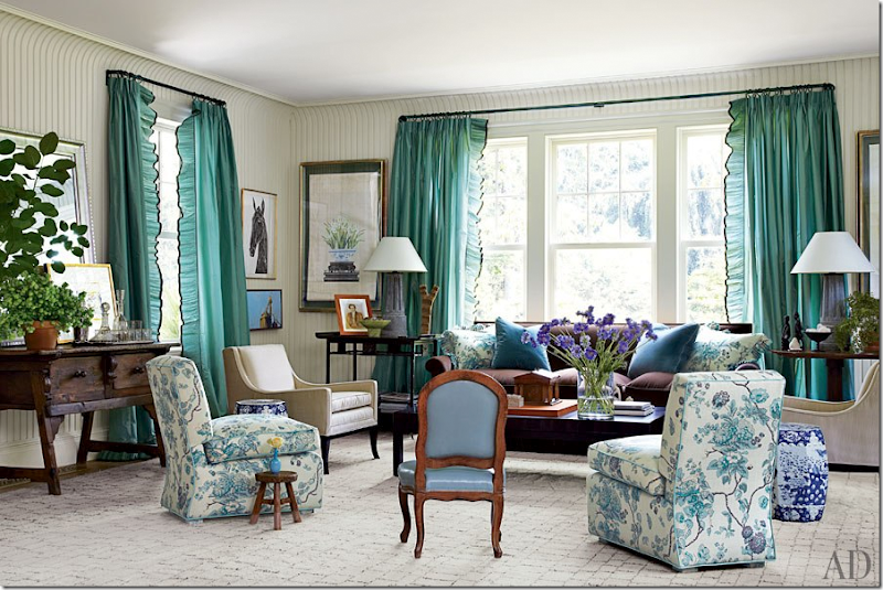
Miles Redd, again, here with a beautifully constructed ruffle on the leading edge.

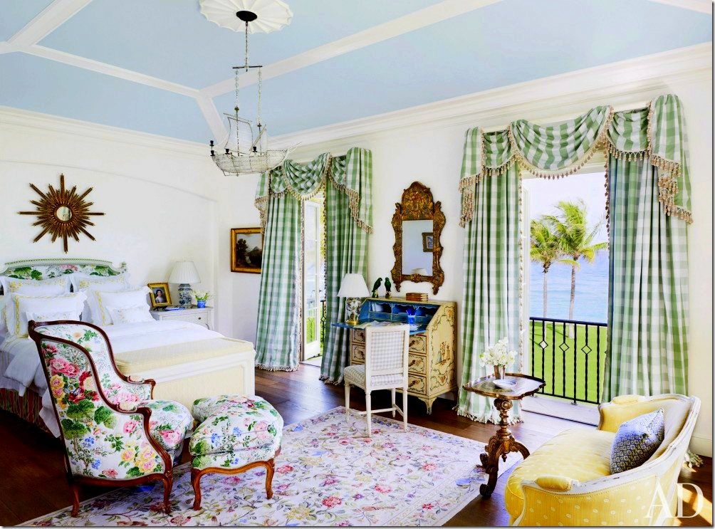
David Easton is another classic designer who uses elaborate window treatments – with swags and valances. The simple check pattern (although I’m sure the fabric is a pricey silk) keeps the curtains from being quite so fussy. This kind of treatment is expensive to make, much more so than simple panels. But, the architecture and the windows and the ceiling height calls for such a curtain.

In a NYC townhouse, Mario Buatta used silk panels of different colors sewn together and then swagged them over the rod. It’s supposed to look like one panel of fabric casually thrown over the rod, but actually, its three pieces carefully sewn together.
 ‘
‘
How blah would this room be with the curtains? This solid fabric is dressed up by the details – the scalloped lead edge and the soft, fabric valance.

There are exceptions of course. If you own a beautifully designed house – with gorgeous steel windows – going without curtains is probably preferable (although, here, I would have used creamy solid linen curtains myself.) A room like this works without curtains.
I’ve always loved how the designer used the fabric color to draw attention to the trim color of the boiserie. By keeping the panels simply – hung from a rod, the room seems a mix of contemporary and classic. One of the most gorgeous rooms!!

A rather simple room without much architectural detail – the curtains provide a much needed element – without them, this room would look bare and unfinished. The valances add the classic feel.
A beautiful room – with panels and shades. The room has a contemporary feel and the style of the curtains add to this. Today – rods have become more important since valances are not as popular as they once were.

Mary Tait from New Orleans is credited with creating “ballgown” silk curtains – full, luscious clouds of silk, with no pleats and fabulous headers. With ballgown panels, decorative rods became more important. Today, headers are much plainer and curtains don’t puddle 10 and 12 inches. With silk panels, I like to keep the puddle to 3” – with linen, I go with 1” now. I prefer just a slight break rather than straight columns of ironed in pleats.

My favorite curtains – the ballgown silk panels of today. Tory Burch’s living room, maybe my all time favorite room ever! I love silk panels when the pleats are not ironed it. Gorgeous!

Well, this is another all time favorite living room – Carol Glasser’s in Houston. She loves color – and the pattern in the fabric is perfect, just enough. The velvet sofa in peach is to die for!! Carol chose to use a rod with panels instead of a more fancy treatment. Either style would have been appropriate, but this more simple treatment seems more 21th century.

Well, wait. Now THIS is favorite living room! How many does that make just today? Seriously – for a young person, who doesn’t want just antiques or outright glam – who wants to mix new with old – this is my idea of a perfect mix. The contemporary light fixture, the modern lamps and art, the antique chairs and table – it’s just a perfect mix – not too much and not too little. I love the pops of color mixed with the whites and stripes. And the curtains are perfect. Shannon Bowers.
Schuyler Samperton – love this in pinks and whites. Without these panels, there wouldn’t be enough pink in here to make such a statement. Again – this is a perfect mix if you don’t want too much new.
Ginger Barber added a trio of panels to repeat the trio of chandeliers in this large living/dining room. Ginger likes to hang panels with ironed in pleats. This is classic – for the new decade.

Another living room that I adore – fabric valances and patterned fabric liven up a classic, sophisticated room.

My favorite window treatment – raised to the ceiling, the panels elevate the ceiling – making the room seem taller. The shade adds needed texture AND hides the dead zone (the large area of drywall between the top of the window and the ceiling.) With the dead zone hidden – the window’s dimensions are hidden and it seems as if they are larger. This is a particularly handy trick to use when the windows or the ceiling is too low.

When you have double height windows – try to go as high as possible. The designer stopped at the double height – and left the triple height bare. This was a good solution for troublesome windows – something that builders seem to love to design.
A lesson in shades and panels:

DON’T: In an actual house found on the internet: first, this owner should have used a bronze rod for less contrast. Second, the rod should have been placed at the ceiling. Third, there should be just one blind instead of two, outside mounted, placed right under the rod – for a more cohesive, smoother look. This way – the dead zone is hidden behind the shade, the windows looks taller and larger and the ceiling appears higher.

The solution: perfection! There is one shade instead of two at each window. The rod is at the ceiling – right under the molding. The shade covers the dead zone – so it appears the window is higher, along with the ceiling. It’s a more cohesive look, a more finished look, a better look.

I like this arrangement – and I like the curtains and shades, BUT: there should be a rod!! I think this looks a little strange without a rod. It makes no sense. It just reinforces that the curtains don’t close, that they are just decorative. It looks phony. Honesty in design!

Another beautiful living room with tall panels brought to the ceiling instead of to the top of the window. Gorgeous! Miles Redd, of course.

Suzanne Rheinstein covered her dead zone with fabric valances – another option instead of using textured blinds. Her rods are beautiful. While I use plain rods – I do love a beautiful rod, like these.
A pretty, soft room. Again, the valances hide the dead zone.

A simple room, with leggy antiques in white – creamy silk provides the ballgown look – a very feminine expression.

Gawd. The gorgeousness!!!! The handpainted wallpaper with the vivid silk ballgown panels. The color of the silk is so pretty. Perfection!!!!!! Miles, again.

Mario Buatta in Houston again – with a double swag. Such a beautiful chandelier.

I’ve always loved this Houston dining room with the beautiful table and chairs and I love the curtains with their soft pattern. Nicole Zarr.

Another favorite – the skirted table in green with blue leather chairs and blue panels.

A bed – between two windows – please, always use curtains in this instance!!

And again – curtains frame the bed like a painting.

I love this – the long row of white curtains, lined and interlined, covering the drywall between the windows. It looks so finished and professionally designed.

An all time favorite bedroom – by Pamela Pierce. Those curtains in blush silk are perfection!! No pleats – they are feminine ballgowns. What a gorgeous room!!
David Easton – again – a simple check, a fancy treatment.

Miles Redd used a soft ruffle on the curtains and on the bed’s canopy. I love the rug.

This great bedroom that Ashley Goforth designed – is all in white with black accents and taupe silk curtains.

Another beautiful bedroom – the fabric shades are in a chintz print that adds just enough of color and femininity to this room.

Lilac chintz. The valances hide the dead zone – and make the windows taller, along with the ceiling.
Available link for download


